Existing desk & mobile IA
Beyond the entry point issues, the information architecture suffered from complexity and confusion driven by dual branding. Multiple brand icon versions circulating in the market created user confusion and gradually eroded trust in the Microsoft brand.

Simplified IA
After completing the entry point and IA mapping for both brands, I presented my findings to stakeholders. Together, we simplified the information architecture by systematically identifying and documenting all page elements.


The final brand transition
To strengthen publisher relationships and create a more cohesive cross-platform experience under a single brand, Microsoft transitioned from Microsoft Start to MSN. This shift provided an opportunity to refresh MSN’s visual identity - evolving the logo and icon to reflect an AI-powered, Copilot-aligned experience while embracing Microsoft’s creative principles of being human, vibrant, and dimensional.

Existing Start and MSN touch points
This flow illustrates what the old entry point looked like. With both Microsoft Start and MSN brands active in the market, news consumption pages often displayed inconsistent branding - showing Microsoft Start elements when users came from MSN.com, and vice versa. To clarify the experience, I mapped both brands' entry points across multiple touchpoints and canvases to document these cross-brand inconsistencies.

Strategy
The mono-colored butterfly logo mark is the most recognizable and widely used representation of the MSN brand. My first proposal was to ensure the logo mark was used with consistency first before we rolling out the colored butterfly together with the new Copilot rebranding in Febuary 2025.
What our users think
General consumer
Based on user research, there was no strong preference between Microsoft Start and MSN.com. However, overall user trust in the MSN brand remained higher — it was more recognizable and carried stronger credibility.
Publisher
For publishers and advertisers, MSN was also far more established and easier to sell globally. Even after two years on the market, many partners continued to refer to Microsoft Start simply as MSN.
MSN reputation
Given MSN’s strong brand recognition, maintaining an interim mono-color logo only added confusion and diluted the overall identity. Instead, rebranding with a refreshed, full-color, and modern logo created a clearer and more cohesive direction.


Color scheme
Drawing inspiration from Microsoft’s heritage blue and the innovative purple of AI, I crafted a balanced palette that reflects both trust and modernity. The adaptable light and dark modes ensure harmony and consistency across all digital surfaces.

Edge New Tab Page
Revamped the legacy Microsoft Start brand across the Edge New Tab Page and all segment pages. Ensured consistent branding across both enterprise and consumer experiences.

MSN mobile app
Updated the app icon and name, splash screen, and first-time onboarding to align with the new brand palette and strengthen brand perception across mobile touchpoints.

MSN.com
Replacing Microsoft Start brand with refreshed MSN brand logo.
There are two version of MSN.com. The classic MSN is built on the old framework. To help users
Existing Start.com now is updated MSN.com
There are two versions of MSN.com: the classic site built on the legacy framework, and the newly rebranded experience. To guide users through this transition, I designed an in-site banner that clearly communicates the rebranding and allows users to easily switch to the new site.

Classic MSN.com
Start.com is built on the new framework with a card layout consistent with the Edge New Tab Page. Since it now links to MSN.com, I ensured users were informed and could easily navigate back to the classic site.


Newsletters
Applied the updated MSN brand across newsletters for all screen resolutions, redesigning MSN Daily, Unfold, Finance, and onboarding pages to strengthen brand consistency and boost engagement by improving readability and visual hierarchy.

Newsletters sign-up page
Recreated the sign-up page to be more welcoming, engaging, and easy to navigate. Collaborated with the Content and Finance Segment teams to ensure the newly launched Finance newsletter was seamlessly integrated and reflected in the updated design.

Marketing page
Beyond branding across product touchpoints, I collaborated with Legal, Global Marketing, and Sales teams to update marketing sites and sales materials.
With the unified theme in place, brand consistency and cohesiveness began to emerge across all channels.

Windows 10
Positioned the MSN icon into Windows 10 to build user trust and brand awareness. Aligning it with other actions and giving users ability to open MSN.com home from a click.

Windows 11
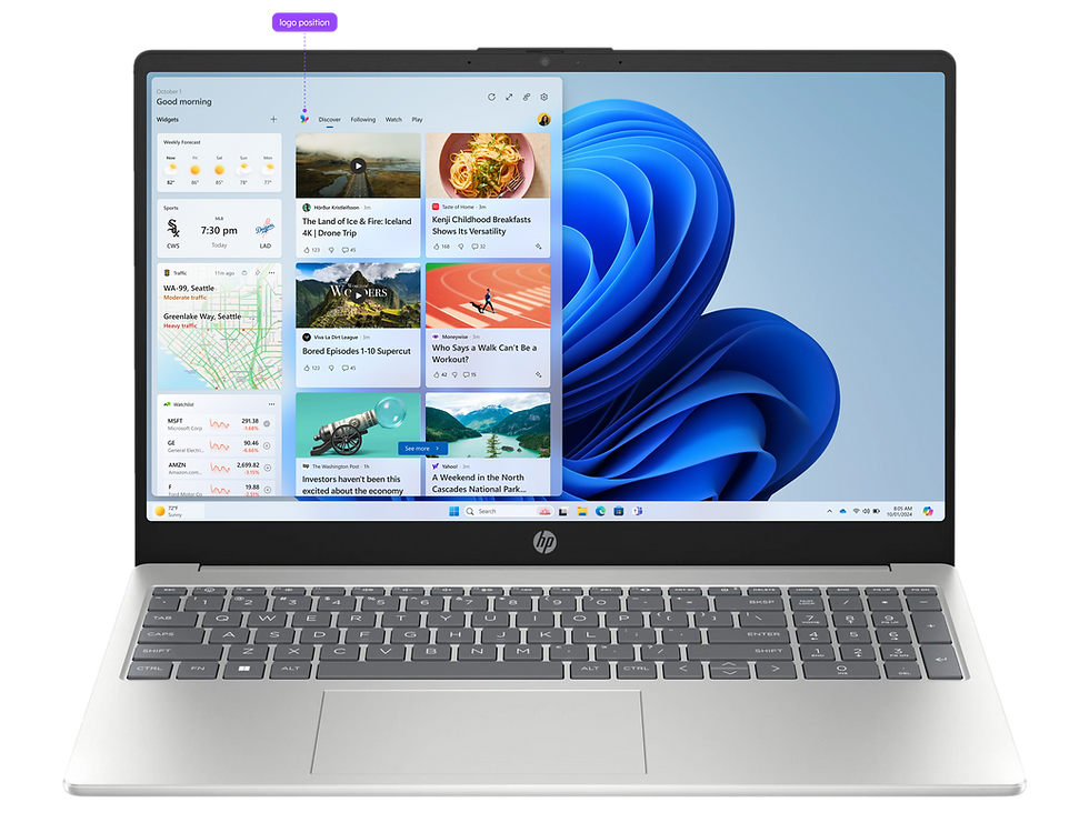
Positioned the MSN icon within Windows 11 to strengthen user trust and brand awareness, adapting its placement to align with the refreshed Widgets Board layout, which differs from Windows 10.

Favicon
The details made the difference. Working with PM and segment teams, I systematically identified and updated all sites displaying the outdated butterfly icon. I also partnered with the content writing team to revise search results, ensuring all messaging remained accurate and current.
Learnings
Navigating through this project, it really made me believe the power of great communication and collaboration matters more than skill alone. Partnering with 75+ stakeholders across teams and continents honed my ability to navigate ambiguity, tackle technical challenges, and be resourceful in finding the right people to move things forward. I also saw the impact of design consistency - by consolidating Microsoft Start and MSN, the team showed how thoughtful, cohesive visuals can shape user trust and contribute to the broader Microsoft AI ecosystem.
Next steps
My focus quickly shifted to MSN in Windows growth after the rebranding is completed, but the team continued working on more features:
-
Monitor user feedback and metrics
-
Alignment with Copilot AI: the New Tab Page is change to AI-curated news feed
-
AI-powered news consumption in Windows
-
Synergy with new publishers
Featured in media
Rebranded MSN sites

MSN Rebranding
Unifying MSN’s brand across platforms with a fresh look

Promotions
To ensure consistent messaging across platforms, I also designed display ad banners for publisher networks and blogs, maintaining color palette alignment for visual cohesiveness.
Overview
I worked with the Brand Design team and over 75 stakeholders to unify MSN’s brand identity with a refreshed, modern logo across all Microsoft platforms, which created a consistent visual experience that enhances its AI-driven products while reinforcing trust, recognition, and cohesion in a rapidly evolving digital landscape.
Outcomes
- 2.1 billion total MSN site visits in the 30 days rebranded
- 36+ product canvases unified
Product design owner
Role
Aug-Nov 2024 (3 month)
Duration
🚀 Shipped
Status
UI, strategy, research, design QA
Contribution
Desktop web, mobile app
Platform
Internet portals


